Calls-to-action (CTA) are the secret sauce to driving people to your offers. If your CTAs aren’t effective at capturing people’s attention and persuading them to the click, then it makes the offer useless.
CTAs can be used on product pages (non-landing pages), in display ads, email, social media, direct mail and pretty much anywhere you can market your offer.
But not all CTAs are created equal. In a world where every brand is fighting for consumers attention, it’s critical that prospects choose your offer over your competitors. In this guide, we’ll uncover tips to creating CTAs that rock.
#1 Place Your CTA Where the Eye Can See
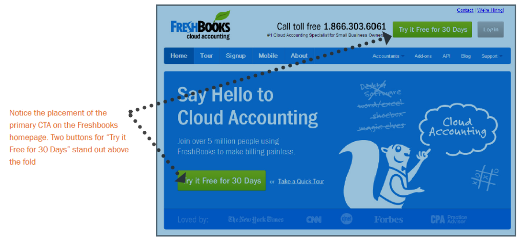
Calls-to-action do best “above the fold” – the space where your web page is viewable to the user without having to scroll down. According to heat map analysis, anything “below the fold” will only be viewed by 50% of people who visit your page. Doubling impressions on your CTAs can significantly increase your lead count.
#2 Clarity Trumps Persuasion
That is one of my favorite phrases I learned from the folks at MarketingExperiements. Often times, marketers will put more focus on being clever than clear. Be crystal clear about what offer is in your CTA. And be specific. If you’re giving away a free guide, say “Download our FREE guide to X.” If you’re hosting a free webinar, say “Register for our FREE webinar on X.” X should clearly convey a compelling benefit of receiving the offer. This is much more effective than “Download Now” or “Get a Free Article.” These simply aren’t specific enough.
#3 Use Contrast to Make CTAs Stand Out
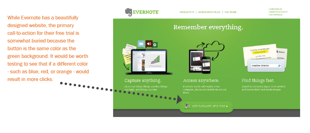
A call-to-action is meant to stand out, so if your CTA blends in too much with your site design, no one will notice it. You want as many eyeballs to land on that call-to-action as possible, so use contrasting colors to make the CTA stand out, and more importantly, use design to make it clear it is a clickable call-to-action.
#4 Link Your CTA to a Dedicated Landing Page
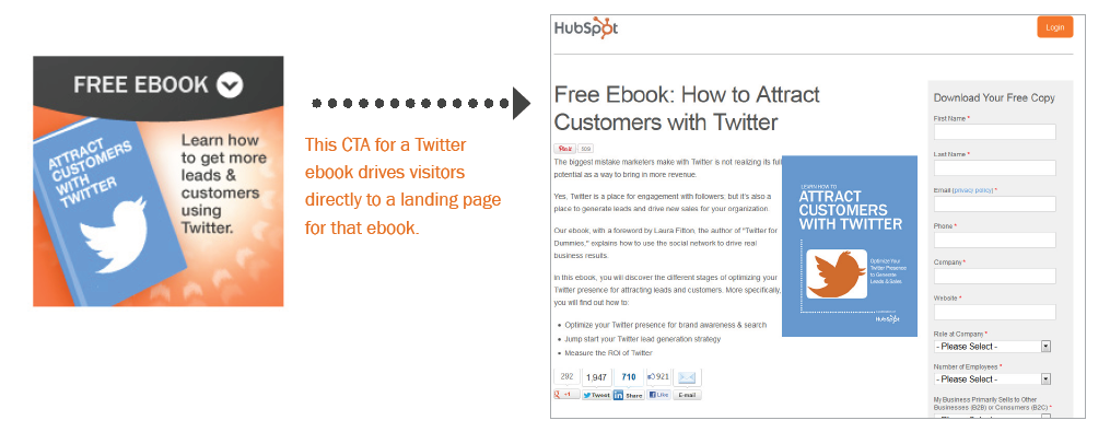
This tip might seem minor, but it’s incredible how often businesses miss this opportunity. Calls-to-action are meant to send visitors to a dedicated landing page where they receive a specific offer. Do not use CTAs to drive people to your homepage. Even if your CTA is about your brand or product (and perhaps not an offer like a download), still send them to a targeted landing page that is relevant to what they are looking for. If you have the opportunity to use a CTA, send them to a page that will convert them into a lead.
#5 Promote Offers on Product Pages
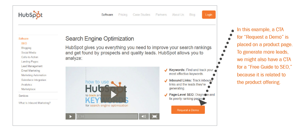
CTAs shouldn’t be one size fits all. If your company offers various products or services, you may want to consider creating a different offer for each of them. Then you can place CTAs linking to each offer on the website pages that are most relevant to that offer.
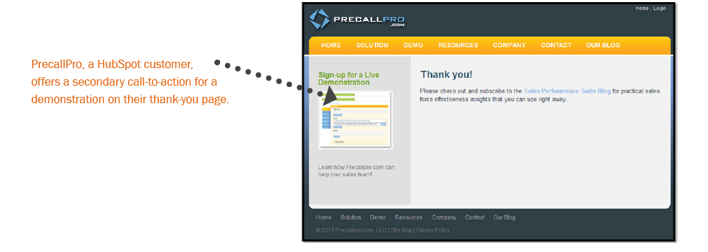
#6 Thank You Pages Are Great CTA Real Estate
Even if someone completes a form on your website (thus they’ve converted as a lead), don’t stop there. Increasing engagement is also a top priority for marketers so that prospects turn into loyal fans.
Once someone reaches a “thank you page,” the page that a visitor arrives on after completing a form, use that space as an opportunity to promote more offers and content. For example, if a visitor on hubspot.com downloads a guide on email marketing, we can offer them another offer for a Email RFP for a chance to see a demo of our email marketing platform.


